Is a graphical representation technique to compare all data in a multivariate data set. Is useful in measuring performance such as that of a car in the above image or the effectiveness of a project in different areas.
A correlation matrix shows the statistical relationships between two sets of data that contain two variables each. Can be useful in looking at long term complex environmental trends such as wind speed/direction and changes in temperature/atmospheric pressure change for example.
A similarity matrix graphically visualizes the similarity between two data points. The above graph is a comparison of notes in a popular rock song, it details the common repetitions heard throughout the music.
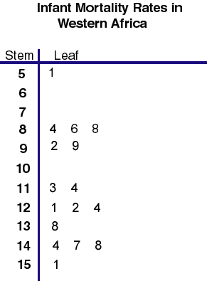
Stem and leaf plots are a way to display quantitative data graphically, it is similar to a histogram in that you can see the distribution of the data. This plot shows the infant mortality rate for Africa, the number on the left represents say 1000 so 9=9,000 and the numbers on the left equal 100 so the 2=200, therefore the number represents 9,0200 deaths.
Box and whisker plots use several different qualifiers such as mean and minimum value and present them graphically. This plot shows car gas mileage in six countries.
A histogram is visual representation of data that clearly shows mean, median, mode and outliers of the data. The more a particular value occurs, the larger the corresponding bar on the histogram. A good way to visualize trends in population data.
This plot shows earthquake data with longitude colored red. A parallel coordinate graph shows multivariate occurrences as a set of overlapping parallel lines that can be used to visualize different patterns.
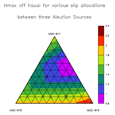
A triangular plot graphically represents three variables that end equaling some sort of constant. This is a fairly complex question that can be clarified by this type of geovisualization. This particular plot shows the impact of waves generated from three different sites crashing on the coast of a Hawaiin island.
A windrose is a graphical depiction of average windspeeds shown on a 360 degree plane that can show which direction the wind comes from. This is a windrose for the state of Maine. The different colors depict varying groups of wind speed.
A climograph shows the average rainfall and temperature of a given area. A bar graph is always used for rainfall and a line graph for temperature fluctuations, this graph is a climograph for Memphis, TN, it is unclear if it is for one year or averaged from several years. Useful for climate science to try and compare typical changes.
A population profile is a geovisualization of human populations and and number of sub categories, typically shown as a side by side "pyramid" figure comparing men and women. This particular profile shows the number of people with and without the AIDS virus living in Eastern and Southern Africa.
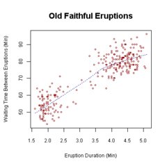
Scatter plots are a visualization tool that typically puts a set of data and shows its number of occurrences throughout time, each dot represents one event that has occurred. This graph maps out the duration and time in between eruptions of Old Faithful in Yellowstone National Park.
This graph shows Southern Hemisphere Annular Mode (SAM) index values (black solid line with diamonds), Southern Oscillation Index (SOI) values (dashed line with circles), and standardized snowmelt index anomalies (gray solid line with triangles). Index Value plots are a visualization tool that allows one to see changes in a particular phenomenons occurrence; for example the map above shows changes in several arctic climate trends.
A Lorenz Curve maps inequalities of wealth distribution in a society. It is an important economic tool that can be used to see the degree in which a societies unequal distribution of wealth stands and perhaps used to try and bridge the gap for a more harmonious society.