A nominal area choropleth map is used to show qualitative data that are categorized without any implicit ordering. This map depicts the results of a voting poll for France's Prime Minister election in 2007.
Unstardarized choropleth maps use raw data without averaged groupings to display data. This map displays a continuous shading pattern from the lowest to the highest number in this data set.
A standardized choropleth map is one that takes data and then calibrates that data to get an averaged and easier displayed data. This map gives just three groups to describe obesity rates in Canada.
Univariate choropleth maps are the most common choropleth map, they depict only one data set, broken into different colors or shades. This particular map shows the average income of households in the U.S.
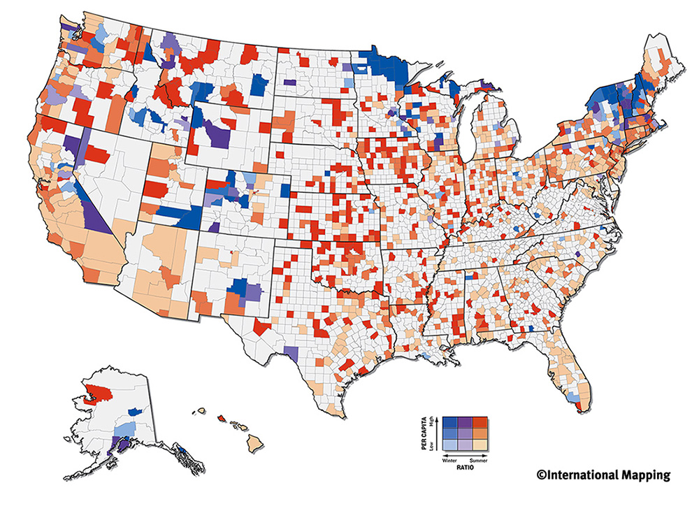
Bivariate choropleth maps show two different variables on one map by using different graphical representations. This map shows the proportion of both summer and winter Olympic athletes birth state, with differing shades of red and blue respectively.
In an unclassified choropleth map, numeric data is converted directly to a particular shade of color. This map shows fertility rates in women in Europe, a maximum and minimum percent is chosen and the shading moves fluidly from one extreme to the other.
Classed choropleth maps are a type of thematic map that uses different shades of color to represent a data group. They group data into an arbitrary number of categories and add shading accordingly, this map shows the male population for ever 100 females. Data is layered onto predefined geographic data, in this example states.
The data is divided into "arbitrary" data ranges that may not offer the most accurate representation of the real world by creating groupings that do not naturally exist. The cartographer chooses symbol sizes for adjacent classes so that the map reader can easily distinguish between circle sizes, and therefore, categories. This map depicts the different colors of rivers that Lewis and Clark observed (circles) along with what mode of transportation the rivers afforded (lines).
A continuously variable proportional circle map uses circles of varying sizes to detail the occurrence of a quantities or frequencies of some phenomenon. The larger the circle the more that data set occurs, and the size is directly related to the data and not a range of data. This map shows the amount of internet users across western Europe.
A continuously variable proportional circle map uses circles to show the proportion of quantities or frequencies, which is show
http://www.abc-clio.com/ODLIS/odlis_g.aspx
Proportional circle maps use circles whose correlates with some sort of derived data from the physical world. This map depicts the populations of state capitals with different circle sizes representing estimated averages of the capitals population.
http://www.answers.com/topic/thematic-map-1
Choropleth maps are a type of thematic map that uses different colors/shading to depict differences in a phenomenon or feature. This map uses different shades of blue to depict the water with drawls in terms of millions of gallons per day. Florida, who has large groundwater supplies, is one of the largest users of water while drier areas out west such as New Mexico do not have as ample water supply and therefore take out much less each day than Florida.
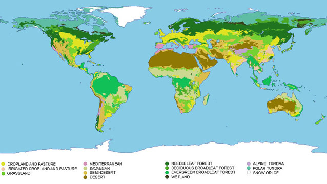
Thematic maps show a particular theme that relates to a particular area. The theme can be more abstract/social such as political affiliation for an area, or something physical in the natural world like different biospheres such as this map displays. This map shows very generalized renderings of the worlds many ecosystems in an attempt to classify the environmental gradients in an easily deciphered map.