Songlines are used by Aboriginal Australians to tell a story of how the Earth was created and to better understand their place in a world. The songs repeat the names of watering holes and other landmarks that let the singer follow this mental map while helping put the landscapes influence on their culture into perspective.
Southern Horizon
Sunday, July 17, 2011
Star Plot
Is a graphical representation technique to compare all data in a multivariate data set. Is useful in measuring performance such as that of a car in the above image or the effectiveness of a project in different areas.
Correlation Matrix
A correlation matrix shows the statistical relationships between two sets of data that contain two variables each. Can be useful in looking at long term complex environmental trends such as wind speed/direction and changes in temperature/atmospheric pressure change for example.
Similarity Matrix
A similarity matrix graphically visualizes the similarity between two data points. The above graph is a comparison of notes in a popular rock song, it details the common repetitions heard throughout the music.
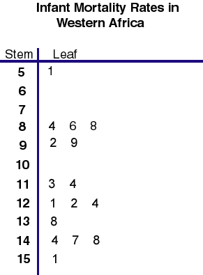
Stem and Leaf Plots
Stem and leaf plots are a way to display quantitative data graphically, it is similar to a histogram in that you can see the distribution of the data. This plot shows the infant mortality rate for Africa, the number on the left represents say 1000 so 9=9,000 and the numbers on the left equal 100 so the 2=200, therefore the number represents 9,0200 deaths.
Box and Whisker Plot
Box and whisker plots use several different qualifiers such as mean and minimum value and present them graphically. This plot shows car gas mileage in six countries.
Histogram
A histogram is visual representation of data that clearly shows mean, median, mode and outliers of the data. The more a particular value occurs, the larger the corresponding bar on the histogram. A good way to visualize trends in population data.
Subscribe to:
Posts (Atom)


