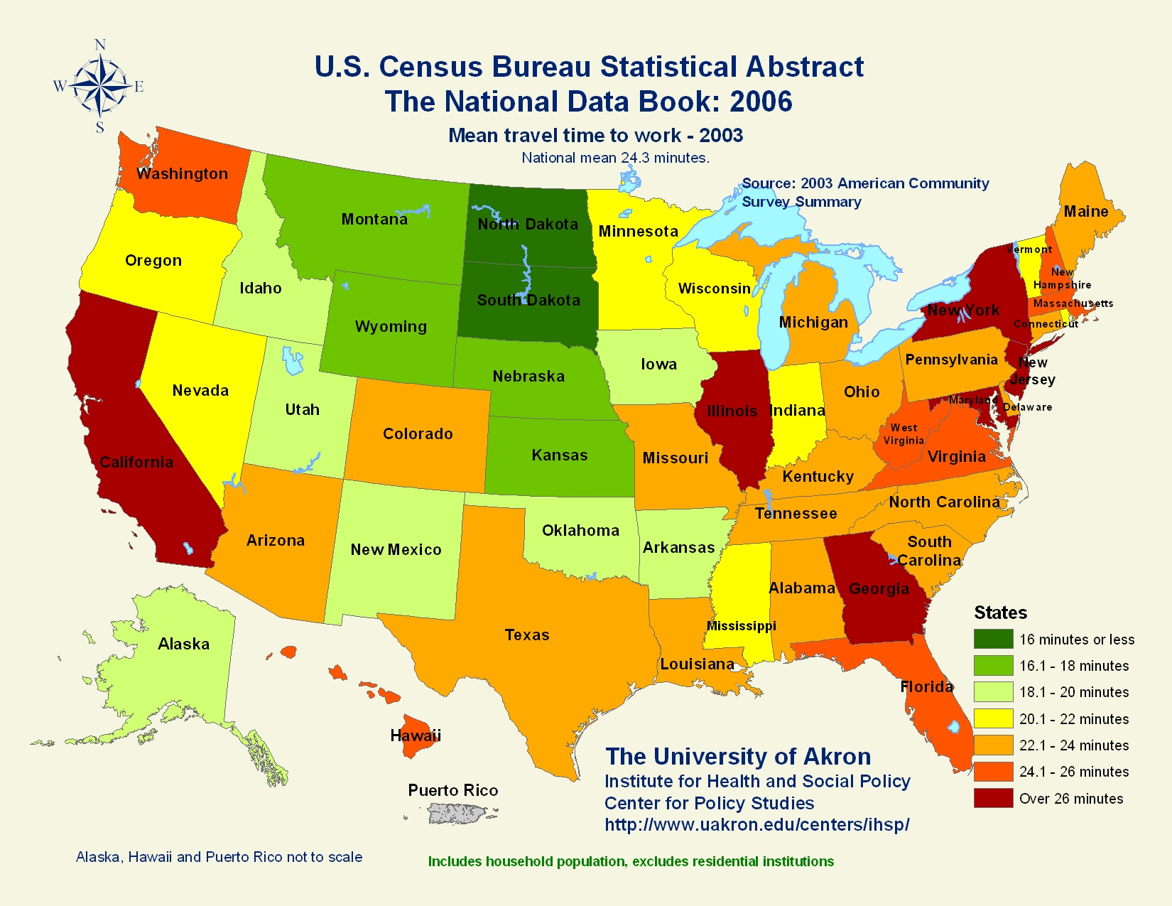
A statistical map takes a variation and quantity of a factor and then presents in different methods such as a dot or shading. This map shows the average time that Americans take to commute to their workplace. It uses different ranges of averages and represents them using different shades of color.
No comments:
Post a Comment