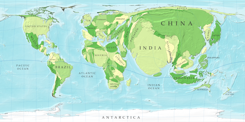
Cartogram maps take some sort of thematic variable and distort the actual landscape to depict it. This map for example shows the size of countries in terms of population not land mass. While the shapes retain some sort of familiarity to their actual size and shape (minus Russia and a few others) the countries are noticeably distorted to depict the human populations within.
No comments:
Post a Comment