Sunday, July 17, 2011

Song Lines

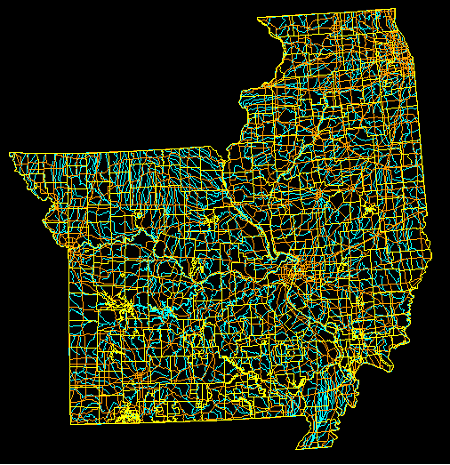
Songlines are used by Aboriginal Australians to tell a story of how the Earth was created and to better understand their place in a world. The songs repeat the names of watering holes and other landmarks that let the singer follow this mental map while helping put the landscapes influence on their culture into perspective. 

Star Plot

Is a graphical representation technique to compare all data in a multivariate data set. Is useful in measuring performance such as that of a car in the above image or the effectiveness of a project in different areas.

Correlation Matrix

A correlation matrix shows the statistical relationships between two sets of data that contain two variables each. Can be useful in looking at long term complex environmental trends such as wind speed/direction and changes in temperature/atmospheric pressure change for example.

Similarity Matrix

A similarity matrix graphically visualizes the similarity between two data points. The above graph is a comparison of notes in a popular rock song, it details the common repetitions heard throughout the music.

Stem and Leaf Plots

Stem and leaf plots are a way to display quantitative data graphically, it is similar to a histogram in that you can see the distribution of the data. This plot shows the infant mortality rate for Africa, the number on the left represents say 1000 so 9=9,000 and the numbers on the left equal 100 so the 2=200, therefore the number represents 9,0200 deaths. 

Box and Whisker Plot

Box and whisker plots use several different qualifiers such as mean and minimum value and present them graphically. This plot shows car gas mileage in six countries.

Histogram

A histogram is visual representation of data that clearly shows mean, median, mode and outliers of the data. The more a particular value occurs, the larger the corresponding bar on the histogram. A good way to visualize trends in population data.

Parallel Coordinate Graph

This plot shows earthquake data with longitude colored red. A parallel coordinate graph shows multivariate occurrences as a set of overlapping parallel lines that can be used to visualize different patterns. 

Triangular Plot

A triangular plot graphically represents three variables that end equaling some sort of constant. This is a fairly complex question that can be clarified by this type of geovisualization. This particular plot shows the impact of waves generated from three different sites crashing on the coast of a Hawaiin island.

Windrose

A windrose is a graphical depiction of average windspeeds shown on a 360 degree plane that can show which direction the wind comes from. This is a windrose for the state of Maine. The different colors depict varying groups of wind speed. 

Climograph

A climograph shows the average rainfall and temperature of a given area. A bar graph is always used for rainfall and a line graph for temperature fluctuations, this graph is a climograph for Memphis, TN, it is unclear if it is for one year or averaged from several years. Useful for climate science to try and compare typical changes.

Population Profile

A population profile is a geovisualization of human populations and and number of sub categories, typically shown as a side by side "pyramid" figure comparing men and women. This particular profile shows the number of people with and without the AIDS virus living in Eastern and Southern Africa.

Scatter Plot

Scatter plots are a visualization tool that typically puts a set of data and shows its number of occurrences throughout time, each dot represents one event that has occurred. This graph maps out the duration and time in between eruptions of Old Faithful in Yellowstone National Park.

Index Value Plot

This graph shows Southern Hemisphere Annular Mode (SAM) index values (black solid line with diamonds), Southern Oscillation Index (SOI) values (dashed line with circles), and standardized snowmelt index anomalies (gray solid line with triangles). Index Value plots are a visualization tool that allows one to see changes in a particular phenomenons occurrence; for example the map above shows changes in several arctic climate trends.

Lorenz Curve

A Lorenz Curve maps inequalities of wealth distribution in a society. It is an important economic tool that can be used to see the degree in which a societies unequal distribution of wealth stands and perhaps used to try and bridge the gap for a more harmonious society.

Bilateral Graph

A bilateral map is a map that allows for both positive and negative values to be shown. This particular graph shows the change in fertility in Chile. 

Nominal Area Choropleth Map

A nominal area choropleth map is used to show qualitative data that are categorized without any implicit ordering. This map depicts the results of a voting poll for France's Prime Minister election in 2007.

Unstandarized Choropleth Map

Unstardarized choropleth maps use raw data without averaged groupings to display data. This map displays a continuous shading pattern from the lowest to the highest number in this data set.

Standardized Choropleth Map

A standardized choropleth map is one that takes data and then calibrates that data to get an averaged and easier displayed data. This map gives just three groups to describe obesity rates in Canada. 

Univariate Choropleth Map

http://www.mint.com/blog/wp-content/uploads/2009/04/mint-income-r3.png
Univariate choropleth maps are the most common choropleth map, they depict only one data set, broken into different colors or shades. This particular map shows the average income of households in the U.S. 

Bivariate Choropleth Map

Bivariate choropleth maps show two different variables on one map by using different graphical representations. This map shows the proportion of both summer and winter Olympic athletes birth state, with differing shades of red and blue respectively. 

Unclassified Choropleth Map

In an unclassified choropleth map, numeric data is converted directly to a particular shade of color. This map shows fertility rates in women in Europe, a maximum and minimum percent is chosen and the shading moves fluidly from one extreme to the other. 

Classed Choropleth Map

Classed choropleth maps are a type of thematic map that uses different shades of color to represent a data group. They group data into an arbitrary number of categories and add shading accordingly, this map shows the male population for ever 100 females. Data is layered onto predefined geographic data, in this example states.

Range Graded Proportional Circle Map

The data is divided into "arbitrary" data ranges that may not offer the most accurate representation of the real world by creating groupings that do not naturally exist.  The cartographer chooses symbol sizes for adjacent classes so that the map reader can easily distinguish between circle sizes, and therefore, categories. This map depicts the different colors of rivers that Lewis and Clark observed (circles) along with what mode of transportation the rivers afforded (lines).

Continuously Variable Proportional Circle Map

A continuously variable proportional circle map uses circles of varying sizes to detail the occurrence of a quantities or frequencies of some phenomenon. The larger the circle the more that data set occurs, and the size is directly related to the data and not a range of data. This map shows the amount of internet users across western Europe.
A continuously variable proportional circle map uses circles to show the proportion of quantities or frequencies, which is show

DOQQ

DOQQ's are aerial photos produced by the USGS that have been rectified to provide a high resolution and combines the image characteristics of a photograph with the geometrics qualities of a map. This DOQQ utilizes the near-infrared bandwidth and allows for a detailed picture of Louisiana's vegetation, lakes and rivers.  

DEM

DEM stands for digital elevation model and is a digitally rendered topographic map. This map depicts the Lake Tahoe basin and could be used to track water movement and change in depth of the lake. DEM's have a number of uses and provide a clear and detailed picture of an area.  

DLG

DLG's or digital line graphs are vector representations of cartographic data. The above map did not have a legend but contains different colored lines for  roads, buildings, natural features, places, points of interest, railways, and waterways. These are very helpful for road maps and camping as it can fit many different landmarks into a clear and concise map.

DRG

A digital raster graphic is a topographical map that has been scanned and then georeferenced to the contour of the Earth. This map utilizes contour lines to express the topography of the area surrounding the river's flood plane, the map also shows man made features such as the pipeline that runs along the marshland near the river.

Isopleth

Isopleth maps connect lines to utilize a common variable that has a consistent frequency. Isopleths map phenomenon that cannot be measured at a single point and must be calculated from data over a larger area. This image shows the rainfall isopleths for the Ten Mile River watershed.

Isopach

Isopachs connect areas of equal thickness of a particular stratum. This maps isopachs connect thickness of  Tioga Bentonite over the mid-Atlantic region. The bentonite is the remnant ash from an ancient volcanic eruption in the area. 

Isohyets

Isohyets are yet another type of isolines that is used to connect areas of equal rainfall. This particular map shows the annual average precipitation in the state of Texas, you can see that wind patterns tend to push the rain fall westerly. 

Saturday, July 16, 2011

Isotachs

Isotachs use isolines that connect areas of equal wind speed. This map looks at the wind speeds in the North Eastern U.S., stronger wind speeds are found further south on this map while the north has greater variance/sharper gradients in wind speed.

Isobars

Isobars are used to connect area of equal averaged pressure on a map. The pressure is reduced to sea level and not the surface pressure of an area in an attempt to have a base pressure. This is a weather forecast in the Great Lakes area.

LIDAR

LIDAR utilizes a laser beam to target and image a range of targets from only rocks to rain to detailed topographic details like this image. This image is a map of ground zero in NYC shortly after the attacks, it provides a high level of detail about the topographic information in the area.

Doppler Radar

Doppler radar uses the reflectivity off of the particles in clouds to get an accurate map of the path of a storm. This particular map shows a storm front along the southeastern U.S. namely Florida and Georgia. Revolutionized weather tracking capabilities. 

Black and White Aerial Photograph

Black and white aerial photographs changed the face of remote sensing and has implications for urban planning to the other side of the spectrum, military actions. It is still a commonly used and useful tool to get a good visualization of an area to help one better meet whatever goals they have for that area. This photo depicts Pearl Harbor, HI, and outlines a researchers study of waste disposal sites in the area.

Infrared Aerial Photo

Aerial photos taken at the infrared light bandwidth is a useful tool for landscape ecology, a discipline that is concerned with land use change and those interactions in the ecosystem at large. Infrared light allows to easily discern between different types of vegetation and it appears in hues of red in this photography. When compared to other photos of the same area it allows for to compare the vegetation makeup and the flow and path of the river.

Cartographic Animation

Cartographic animations are familiar to anyone who has ever seen a weather forecast. Cartographic animations take a map and show temporal change or allows for some sort of interactivity; when you see rain formations moving along a map that is a cartographic animation. This particular map shows the Omaha, NE trail systems and lights up the particular trail that the user puts the mouse over.  

Statistical Map

A statistical map takes a variation and quantity of a factor and then presents in different methods such as a dot or shading. This map shows the average time that Americans take to commute to their workplace. It uses different ranges of averages and represents them using different shades of color.

Thursday, July 14, 2011

Cartogram

http://www-personal.umich.edu/~mejn/cartograms/
Cartogram maps take some sort of thematic variable and distort the actual landscape to depict it. This map for example shows the size of countries in terms of population not land mass. While the shapes retain some sort of familiarity to their actual size and shape (minus Russia and a few others) the countries are noticeably distorted to depict the human populations within.

Flow Maps

http://www.mapthemind.com/thinkingmaps/themaps/flow/index.html
Flow maps or flow charts are written out depictions of ideas. They can also show the flow of say immigrant populations into a country. This particular map shows the outline for a novel and how the author wants to map out the order of their work.

Isoline Maps

http://www.srh.weather.gov/jetstream/synoptic/ll_analyze_slp_soln.htm 
An isoline map is a map with continuous lines joining points of the same value. This one connects the barometric pressure of the atmosphere, while the pressure most likely fluctuates somewhat connecting it with an averaged isoline helps give the viewer a decent perspective on the changes. 

Proportional Circle Map

http://www.abc-clio.com/ODLIS/odlis_g.aspx
Proportional circle maps use circles whose correlates with some sort of derived data from the physical world. This map depicts the populations of state capitals with different circle sizes representing estimated averages of the capitals population.

Choropleth Maps

http://www.answers.com/topic/thematic-map-1
Choropleth maps are a type of thematic map that uses different colors/shading to depict differences in a phenomenon or feature. This map uses different shades of blue to depict the water with drawls in terms of millions of gallons per day. Florida, who has large groundwater supplies, is one of the largest users of water while drier areas out west such as New Mexico do not have as ample water supply and therefore take out much less each day than Florida.

Dot Distribution Maps

http://www.census.gov/geo/www/mapGallery/2kpopden.html

Dot distribution maps use dots to depict a phenomenon or feature that exists in the world. This map uses dots to depict the U.S. population as of the 2000 census. Dot density maps can be potentially misleading as the spacing and size of the dots is chosen by the cartographer and may therefore not be fully accurate with the actual phenomenon.

Proganda Maps


http://liberalvaluesblog.com/tag/ronald-reagan/

Propaganda maps are just that, maps that are used by governments or other interest groups to depict another region in a way that is favorable to their cause. This map, although not actually used by Regan, is a comical propaganda map depicting the former Presidents' views of the world or at least what his rivals seemed to think the President's views were.

Hypsometric Map

http://www.g-to-g.com/index.php?version=eng&module=5&page=2&filter=repressed
Hyposometric maps use shading to present changes in topography of an area. This particular map shows the typography of the former USSR.

PLSS Maps

http://www.rootsweb.ancestry.com/~alfrankl/landrecords.htm
The PLSS system is used in the U.S. to subdivide and describe land that is in the public domain. Although much of the land originally surveyed is now in private hands the system is still useful for the public lands that are left. This particular map shows the rectangular PLSS grid system across the state of Alabama.

Sunday, June 26, 2011

Remote Sensing/ Topographic Map

This is an aerial photograph that acts as a topographic map. It depicts George Washington's Birthplace which is a national memorial. You can see the varying land uses around the park. This is useful for tourists planning a guide to the area to get a feel for what they might find.